


The End of the Redesign vs. Brand Consistency Dilemma: Introducing the Brand Alignment KPI
Packaging activity operates at enormous scale. The global FMCG packaging market is worth hundreds of billions of dollars annually, reflecting a constant stream of pack updates, launches, and redesigns. More than 75% of new FMCG product launches involve updated or redesigned packaging, making redesign a core part of innovation cycles.
So the real question isn’t whether to innovate; it’s how to do it without compromising brand consistency. The advice is everywhere: stay consistent, protect recognition, preserve key assets like colors and logos, and make designs feel fresh yet familiar.
In other words, brand teams often spend weeks debating whether a design “feels right.”
We’ve turned that intuition into a measurable score.
How? PackSee.AI now includes Visual Brand Alignment: a new KPI within the Engage pillar that measures how closely a pack design matches the brand’s established visual identity. It helps teams ensure that new designs are not only compelling, but also consistent, recognizable, and truly on-brand.
Why it matters
Great pack design must balance freshness with recognition. Visual Brand Alignment helps teams:
- Protect consistency across SKUs, sub-brands, and line extensions
- Make early-stage design decisions with greater confidence
- Identify what to refine before moving forward
- Avoid designs that perform well but feel off-brand
How it works
The model compares test designs against reference pack designs, either publicly available or client-provided, to assess alignment with the brand across key visual dimensions:
- Color
- Typography
- Naming
- Imagery
- Logo
- Layout and pack architecture
By analyzing these elements together, the model determines whether the design remains cohesive and aligned with the brand’s visual system.
What you get
The Visual Brand Alignment Score is a single, objective metric for brand design consistency, powered by a rigorous, multidimensional AI analysis.
Score output (0–100):
- Good → Strong alignment with brand visual identity
- Average → Partial alignment, some inconsistencies
- Poor → Significant deviation from brand standards
Alongside the score, you also get actionable interpretation:
- A clear summary of strengths
- Specific areas for improvement
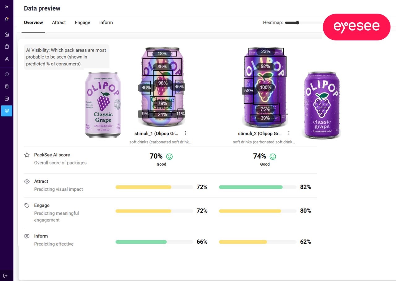
The Olipop Redesign Example
Recently, Olipop launched a redesign of its grape flavor packaging. When we evaluated the new design using PackSee.AI, it outperformed the original in both attention and appeal. However, the Brand Alignment metric revealed the other half of the story. The original design scored 91, while the redesign scored 85. This gap indicates how far the new look has shifted from the packaging that shoppers already recognize.
The analysis showed that while the logo and grape illustration remained consistent with the original, the background color and health-related callouts were the elements that changed the most.
Since a score of 85 is still considered strong, the trade-off may reflect a calculated risk that the Olipop brand team was willing to take in order to stand out on the shelf. However, when aiming to refresh a product’s packaging—and deciding how far to push changes—the most important factor is to rely on data rather than instinct alone.
In other words, PackSee.AI Brand Alignment metric makes these trade-offs visible, helping brands strike the right balance. It clarifies the role each visual element plays and quantifies the potential risk associated with changing them.
Conclusion
Redesign is inevitable, but losing brand identity doesn’t have to be.
For the first time, teams no longer have to rely solely on subjective judgment to assess whether a design “feels right.” With Visual Brand Alignment, they can validate it: quickly, objectively, and with confidence.
Because the best packaging doesn’t just stand out, it instantly signals who you are.
Eager for more? Check out Brand stretching without breaking: Using behavioral data to guide innovation


.svg)